How to design an infographic that (actually) engages your audience
At Sookio we’re offering a new design service for content marketing. Our designer, Adriana Kaneva, explains how she turns dry data into infographics that will appeal to your target audience.
An infographic is a visual representation of content. Because they represent data in a way that the audience can see, instead of read, they are an immensely effective and engaging way to communicate complex messages to your audience.
The reason behind this is quite scientific. The human brain absorbs and synthesizes graphic information faster than any other stimuli. An everyday application of this principle is found in road signs, for example. We can all agree that a road sign is faster to recognize and assimilate, therefore more effective, if it communicates through visuals, rather than text.

When designed well, the visual content succeeds in three core areas of value:
Appeal: Infographics are more attractive to the viewer than simple text. They invite the audience to engage and explore the content before information is actually processed. In practice this is demonstrated by the tendency of users to share visual content more often than plain text. A blog post, for example, will be more compelling if it includes some form of visual communication such as images.
Comprehension: Additionally, apart from being quicker to assimilate, effective graphic content allows for almost immediate recognition of the relationships between objects, inviting the reader to effortlessly navigate through the content. Contrasts of size, shape, colour and orientation direct the eye and help with the organisation of complex data in a clear comprehensive structure.
Retention: The third valuable asset of visual communication is retention or the property of graphics to be easily remembered. Because of this property the content of infographics and its relation to the brand is enforced and more importantly stored in the memory of the audience.
So infographics can benefit your content a great deal. However, designing an effective infographic can be tricky and requires diligence and careful analysis of the content. The process is different for every designer but it involves addressing some common considerations.
Communicate visually, not verbally
In the context of visual content and infographics this might seem a bit obvious!
However, it is amazing how often we stumble upon visual treatment of content that does not communicate the content itself but rather stays alongside it as a sort of an eye-catching but useless decoration.
Complex information such as statistics for example can greatly benefit from the use of charts and graphs. The purpose of infographics is to communicate visually, not verbally.

Dress to impress, not to confuse
Information design, however, extends further than simple charts and graphs. It involves taking the raw content and turning it into visually appealing graphics that would serve and engage the viewers. Yet, in the process of creating stunning visuals designers should remind themselves that at the end of the day content is king. Their job is to dress this king properly and respectfully, not turn him into a fool.

Every story has a beginning, a middle and an end
...But not necessarily in that order.
Kings and fools don’t exist on their own and are actually part of a bigger picture. They are characters with specific roles and purpose. Accordingly, different data chunks have specific roles in the content and should be presented in a logical and consistent order. It cannot be stressed enough how important it is for designing an infographic to read and understand the information first.
Designers need to know the story before they can tell the story.
Cleanse your palette
And stories usually have happy endings, so designers should use warm colours, right?
Well, grown-up designers know that there are more nuances to a story. Colours play an important role in setting the mood and atmosphere of the visual content. Different topics also suggest different colour schemes.
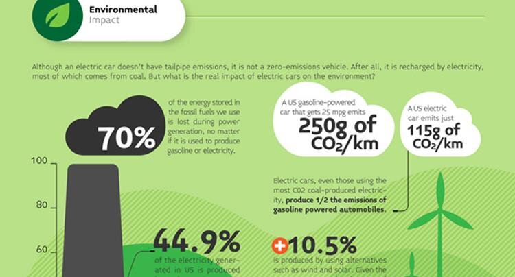
For example, an infographic on the reduction of CO2 emissions by the use of electric vehicles might be executed in green and yellow. On the contrary, an infographic on the effects of global warming might be coloured in greys and reds. The topic is the same - preservation of the environment. The mood is different. The colour palette should support both the topic and mood of the content and can also be a useful reference to the brand identity.
That’s your type
Brand identity is usually institutionalised by thick brand manuals that deal with the specifications around how, where and what type to use for any sorts of brand paraphernalia including visual content.
However, when this is not the case, type (like colour) can be used to create a certain mood for the content due to its connotative qualities. Type can be classic, or playful or elegant. Or Helvetica. And it is important to coordinate the type with the content in order to achieve a rich and engaging presentation.

Talk to us about content marketing
We work with clients across different sectors to create original digital content which engages their target audience. To find out what we can do for your brand, please get in touch.

Useful Info
Find out more about our digital content services, including video, copywriting, social media and design.