The Gaza conflict and the power of infographics
I recently started to follow a Twitter account which was tweeting the events of the Spanish Civil War as it would have unfolded all those years ago. As few days later I had to stop, because my feed was becoming full of horrific tweets from a modern-day conflict in the Middle East happening right now.
At the time of writing the death toll in Gaza during Operation Protective Edge has passed 1800, 80% of whom are civilians and hundreds are children. Events are being tweeted by traditional news outlets, civilians on the ground, journalists, politicians, charities and the Israeli Defence Force itself.
While the idea of social media offering an outlet for such a diverse mix of viewpoints to flow freely is still relatively new, what feels different about this particular conflict is the use of infographics to support the narrative.

Tweet from @LibyaLiberty (who we strongly suggest you follow on Twitter)
Highly shareable content, they make a complex situation very simple, putting things in a black/white, us v them, goodies v baddies kind of framework.
People like that. It can be difficult to articulate how you feel about the conflict within the confines of a 140 character limit, and sharing this type of content is a way of expressing an opinion.
It's also harder to argue with a graphic. The powerful combination of text, facts and image amplify the message, leaving little room for discussion.
Let's take a look at the different approaches taken by those involved in or reporting on the conflict: the opposing sides, charities and the UN, and the press.
The opposing sides
The IDF Spokesperson Twitter account (359k followers) is particularly adept at using infographics to get their core messages across.
A stark message such as "Day 24 of Operation Protective Edge. Since the start of the operation,we have struck 4370 terror targets" will be accompanied by graphics featuring bold colours, clear icons and short text in block capitals.
They post these infographics with a shouty 'RETWEET', and retweet people do, in their thousands. In days gone by it would have been airborne leaflet drops, but now Twitter gives the IDF a far more effective channel through which they can tell their side of the story.


As far as I can see, the only Hamas equivalent to this is @hamasinfo, with 85K followers and just simple text tweets in Arabic. By always writing in English, @IDFspokesperson has its eye on getting the global community onside.
Visualising Palestine is a website which produces infographics on political issues concerning Palestinians, producing detailed content such as the The Five Stages of Grief, which contrasts life in Gaza with post-9/11 America.
Charities and the UN
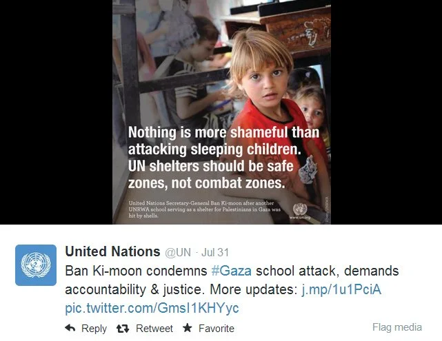
Neutral organisations like the UN (2.91m followers) also use powerful graphics when tweeting about Gaza. Rather than visualise data, they use real photographs of children and the devastation that surrounds them to catch the reader's attention.
Save the Children UK (85k followers) produces some very powerful images. Again, block capitals and bold colours underline the seriousness of the message. This is no time for pastels and swirly fonts. They take a similar approach to the IDF, opting for icons rather than real photographic images.
OxfamGB (148k followers) doesn't produce very sophisticated or consistently branded infographics - such as the map of the Isle of Wight with 'Gaza' layered on top - but they are effective in conveying their message.


In the press
In the UK, The Telegraph created a very powerful infographic to show not just the death toll of children in numbers, but with their names too. See the image in full in their 22 July 2014 article Revealed: the Palestinian children killed by Israel's Operation Protective Edge.
The Washington Post, in their piece Children paying a terrible price in Gaza (updated daily) and an AFP image posted on their Facebook timeline, takes a similar approach.


Note from the author
It's an emotive subject, so I should point out that I have no personal ties to the Middle East and no religious affiliations. So for me, it's not about taking sides; I'm just someone lucky enough to live in a stable, peaceful part of the world who would like to see an end to military forces killing children and their families. Please stop, it's heartbreaking.